The Conference Speaker Investment
20 November 2014
Speaking at conferences is an investment of speakers in time, energy, and knowledge. The quality of a presentation and of the conference itself can be measured in the amount of investment made.
Here are my tips for future conference speakers.
Choosing A Conference
At which conference you choose to speak is arguably as important as the topic selection and the amount of work put into the presentation. There are very obvious factors that everyone should consider such as the overall theme, audience that will be attending, and overall conference size.
A conference of 200 people on a specific topic in a remote region deserves a very different preparation than one of 2000 people on a general topic in a large tech hub. The smaller of these two would require something very detailed on which you consider yourself an expert because the people in attendance will expect it. At the larger one you can still give the same detailed talk, but you also have the option of being more broad, appealing more to introductory learners, and not having to be an absolute authority on the subject.
Beyond those, there are other very important factors that I consider essential criteria when selecting where to speak.
Recording
Unless you are going to give the same presentation over and over again (and some do this, refining it over time), having your talk recorded means you instantly increase the size of your potential audience by 1000x. Not only does this force you to know what you are talking about and make pretty slides, but it helps justify the amount of work required to prepare.
Rather than having only static images to refer to or your sweet (cough) prezi, those wishing to review your presentation can do so directly from you in addition to the static version (see 'Publishing' below).
Some conferences will really go above and beyond in recording. Devoxx not only uses professional recording equipment with manned cameras, but they also publish their talks on parleys.com which features slides that are synchronized with the video. You can watch my talk from last year on Dagger for an example.
Venue
With the amount of time it takes to prepare a presentation, you want it to be seen and heard by as many as possible. A bad venue can really turn an otherwise interesting set of speakers into a painful experience. Not being able to see or hear in a room is bad, but having to turn away tons of people due to poor planning or room size is even worse.
Beyond the physical, the technical facilities of a conference are of great importance. The size, placement, and resolution of the screen ensures that your content will be legible to all in the room. At this point it is inexcusable to have anything other than a widescreen, high-definition projector. Screen size should simply be as large as possible. For a presentation of anything over 20 or 30 a speaker and mic setup is essential. The size of the room should dictate how large the speaker setup needs to be.
This is another Devoxx slam-dunk as it is hosted inside a movie theater with stadium seating (pictured). Presenters wear tiny mics and stand beneath an absolutely massive screen onto which both your slides and a real-time video feed is shown. As both an attendee and presenter it's a fantastic experience.
Organizers
The people behind the conference is an interesting factor to guage a conference by but it turns out to be an important one. Some conferences are run by companies who have motives beyond the conference content itself. All conferences will have sponsors and may even be run by people who work for a single company. The difference is the companies for which running conferences is part of their job. By doing this, their motivation for recording talks, finding the best venues, and having the best equipment is greatly diminished by ulterior motives.
A conference that is run by a company is likely still a good conference to attend and will attract good speakers. It's just a choice you have to make as to whether you want to support something like that. There is a well-known Android conference in San Francisco that I would love to see destroyed by a Droidcon SF since they are guilty of not doing the things listed above.
Creating Your Slides
There are tons of articles on how to create effective slides. Slides should normally exist to augment and re-enforce you. Granted, some things like screenshots and code snippets are invaluable, and invert the roles allowing you to augment them. I'm not going re-iterate the well-known things and instead focus on what's applicable for technical talks.
Getting Started
There's a variety of tools to choose from for creating slides, choose the one that best suits the job. Google Slides is fantastic for collaborating on content, Keynote has a fantastic balance of simplicity and power, and Javascript-based tools allow fantastic interactivity. There's also PowerPoint, but I'm not a Windows user. All will work, choose the one which will make you the most productive and I'll leave it to other articles to compare.
Slides should be done in widescreen (16:9) at 1080p (1920x1080) resolution. Hopefully this will be the native resolution at which they will be played (as discussed above), but at worst they will be downscaled which is always better than having them upscaled.
Never start a presentation with a description of who you are, what you do, and the outline of your slides. This is content for the abstract of your talk that most people will have read and used in choosing to attend. Those who didn't read this information don't need it because they chose your talk for its catchy title or something and thus won't care either way.
Text & Bullets
Good 'ol bullets of text. The fundamental building block of a presentation. Some people can get away with using only single words, short phrases, and pretty images but rarely does that fly for a technical talk.
There is no "too large" for font size of your text. Better to err on the side of large than too small. A single slide should only be able to fit 6 single-line bullets of text. What you think is readable when sitting two feet from your 23" monitor might not be readable at full scale. Start your slideshow and stand back 6 to 10 feet (depending on monitor size) and ensure that everything is readable.
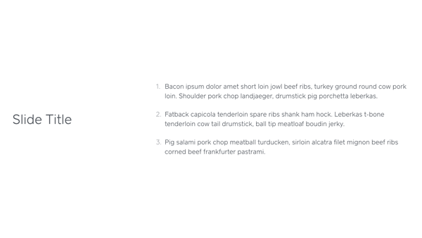
Use simple layouts for text on slides which maximizes the available space and readability. The large size of your font tends to force this, but some slide layouts too heavily emphasize design rather than practicality. For example, Square has this one absolutely atrocious slide template (pictured) which put the title and bullets side-by-side and end up wasting 2/3rds of the screen real estate. It looks great when sitting in front of your laptop but in actual presentation only the first groupings of people will be able to read them with ease. The title should be at the top, bullets underneath, and font size at least doubled.
The text on the actual bullets is tricky to get right. You want enough information to convey the point you are trying to get across but not so much to force the audience spend most of their time reading. Sticking to a single line is usually a good litmus test for the right amount of content. Each bullet should animate in individually when you are talking about it. Having all the bullets on the screen at once will send most people off to read them all rather than listen to you.
Visualizations
Conveying abstract or complicated concepts effectively with only text can be challenging. Visualizations can aid in helping the audience understand exactly what it is you are describing.
Similar to text, visualizations should be large and unambiguous. If there is more than 10 or 12 components you are going to saturate the individual's ability to understand the content. Remember, while you are familiar with everything happening on screen this is the first time the attendees are seeing it.
Visualization should start simple and gradually enhance themselves if there are more than 5 or 6 components. In addition to bringing components in gradually, deliberate animation is also extremely helpful. The animation draws the eye to the correct place and should be used to help convey the concept which you are describing. In Keynote, break the visualization up into multiple slides and use the 'Magic Move' slide transition to handle figuring out most of the moves for you.
A visualization is not a substitute for a description of what is happening and why. Phrases like "as you can see" are red flags that you need to be the one explaining the behavior rather than relying on the visualization or animation to do it for you. Avoid trying to force the user where to look with commands. If there is an area you want to focus on, fade the unimportant parts of the visualization to 50% opacity to naturally draw their eyes to the important sections.
Code
What is a technical presentation without code? Showing code on screen is a very hard thing to do correctly. Code comes with an inherent cognitive overhead versus text, but it also is fraught with opinion in both language and style.
It should come as no surprise that yet again size is important here. You don't need to go as large as text, but limit the number of lines of code to 12 to 15 on a slide. Similar to the gradual enhancement in visualizations, if you need to show more than 5 or 6 lines of code break it up into logical chunks and fade them in individually. Explain each section as it comes in and then summarize in one line again once the complete snippet is on the screen to reinforce the behavior.
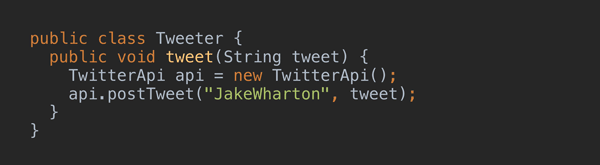
Syntax highlighting of code is essential for slides. Programmer's eyes are trained to recognize the semantic building blocks of code through syntax highlighting. There is absolutely no reason to omit this. IntelliJ 14 or newer will do rich-text copy with syntax highlighting and can even be customized to use a different style when copying than the active one (search 'rich' in preferences).
Often when showing code in a presentation, you will want to show code snippets that change between slides as a result of demonstrating new APIs or just as a different example. Back-to-back slides with syntax-highlighted code is hard on your audience because they need to both understand what changed and then understand why. Every single change in code you make should initially desaturate the unchanged parts and then automatically re-saturate after a short interval (pictured). Duplicate the original slide and update it with the changed code. Copy and paste the code on the new slide and position it at the same x and y positions. Select the parts of the code which haven't changed and set them to a neutral gray. Put a fade-out animation on the desaturated code of 0.5 seconds with a delay of 1.5 seconds and set it to play automatically when the slide is shown. Put a 0.5 second cross-fade transition between the two slides.
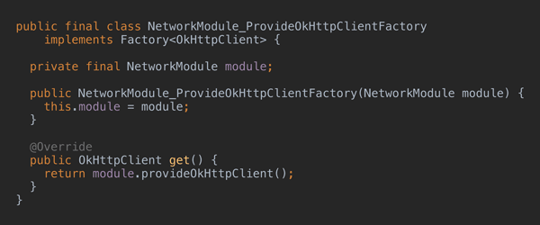
The same desaturation technique should be used whenever you need to emphasize a section of code that is already on screen. Here, however, it's wise to do it as explicit animation steps for both desaturation and re-saturation since you want the focus to be kept for as long as you are talking about that code (pictured). Use the same technique as above with separate slides with the exception of having the desaturated code fade out on click.
Publishing
Unless a conference has really professional recording and post-processing the quality of your slides on the video will be low. Publishing them separately allows for a much higher quality and gives control to the viewer as to how quickly or slowly they want to move forward. If you have followed the above recommendations your slides can mostly likely stand on their own without the video. Those referring back to them won't need to use the recording and those not in attendance can look at them while waiting for the video to be released.
SpeakerDeck is my preferred publishing platform of choice. It has a no-frills interface without ads or noisy chrome around the slides like other sites. It also allows embedding if you have your own website that chronicles your presentations.
To export your slides, make a copy of the original version and append '-ForExport'. You will almost certainly have to make changes for export and operating only on a copy ensures you don't accidentally overwrite the original. After opening the copy, immediately export a PDF. Be sure to select the options that creates a separate slide for each animation step and include the slide number. Open the PDF and flip through from start to end noting any changes you want to make in a text editor with the slide number. Flip back to the presentation and make the changes, re-export, and repeat until you have something you are satisfied with. The two most common changes I have to make is removing animations which play immediately after transition and splitting slides with complex move animations into multiple.
Once you are satisfied with your PDF, do one final export which disables the slide numbers and sets the image quality to its highest setting. Save both the 'ForExport' version of the presentation and the final exported PDF along side the original. I've had to circle back and tweak the export or email the exported PDF on multiple occasions. Upload the presentation to SpeakerDeck, give it a good title and description, and check the little publish box. Once the video is made available, be sure to update the description with a link to the video.
These are my opinions having done this only about 10 times. By no means am I an expert, but I think I have good grasp on how to choose the presentations that I give. And if you didn't pick up on it, Devoxx and Keynote are my current bar by which I measure the venue and presentation quality, respectively.
I've uploaded some files from my most recent presentation on Dagger 2 as examples:
- Original Keynote (zip): drive.google.com/open?id=0B490UMAh3G13TjBrTGQ2OVBFdjA
- Original PDF Export: drive.google.com/open?id=0B490UMAh3G13YjZUNnNoaHluWmc
- 'ForExport' Keynote (zip): drive.google.com/open?id=0B490UMAh3G13U3pOZ0o0WXNUXzA
- Final PDF Export: drive.google.com/open?id=0B490UMAh3G13ZlFfVVdiZDJvcGs
- SpeakerDeck upload: speakerdeck.com/jakewharton/dependency-injection-with-dagger-2-devoxx-2014
— Jake Wharton